Identity
In the identity studied by Regrets Only for the members of the MoMA, a path guides the gaze and the heart.
Date:
24 March 2025
Identity, Minimalist, Digital


When observing the visual identity of the MoMA members, the first thing you will probably notice is a linear path - it is everywhere and runs through everything, cutting and connecting each element. The line, or the path, was born from in-depth research conducted by the Boston-based studio Regrets Only during the design of the identity for the museum's membership program.
"During our research, we came across an experiment that MoMA had conducted over a decade ago, entitled 'I went to MoMA and…'", tells designer Ariana Gupta. "It was a simple yet powerful invitation asking visitors to complete the sentence and share their museum experience on cards." The responses ranged from playful to deeply personal, revealing how a visit to MoMA meant something different for everyone. “Your MoMA” was our interpretation of this insight: an identity that celebrates the personal connections that members make with art and with each other, thus discovering a museum that becomes unique for each of them."

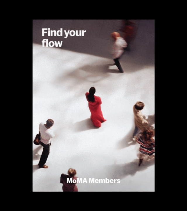
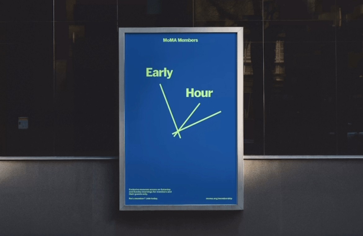
The idea of “Your MoMA” led the team to create the concept of the path – a thread that represents how, as a member, “you can meet people, find meanings, and connect ideas – both to move and to discover what excites you most.” The path has been ingeniously used across different touchpoints, such as in posters: in one of them, animated, the lines transform into the hands of a clock that keeps time, communicating early and exclusive access to members.
Further developing the idea, the team created different personas and animated the paths to reflect their character. “These personas were designed to illustrate how each path reflects the unique journey of each member, which can vary from person to person and even from one visit to another,” explains creative director Caleb Halter. “Sometimes you want to explore every corner of every gallery (The Roomba), other times you only come to see your favorite piece (The Beeline), and on other occasions, you move lightly from one floor to another (The Hummingbird).”

The team set the wordmark in the museum's proprietary typeface, MoMA Sans, using it throughout the brand to maintain consistency. However, the identity for members had a specific task: it needed to integrate into the visual world of MoMA while still offering something new for its regular visitors. “Balancing the distinctive identity of the Membership program with MoMA’s legacy was crucial,” says Gupta. “MoMA Sans provided a solid typographic foundation, so we introduced variations through dynamic alignments and irregular compositions to create a sense of movement. While the main palette of MoMA is grounded in bold primary colors, we developed a nuanced range of complex shades to reflect the depth of the members’ experience while respecting the museum’s commitment to accessibility.”


As Gupta explains, the text was treated playfully, creating rhythm and movement. Instead of being rigidly aligned, it was allowed to move freely in the visual space and, in some cases, flows like a cascade of words. This approach adds a lyrical touch to the overall identity, reinforced by a light but purposeful use of geometry, typography, and color.