Brand Identity
Spiralling snails and changing triangles define the visual identity of Studio Yukiko for the Grand Snail Tour.
Date:
20 March 2025
Advertising, Identity, Website

The Grand Snail Tour takes place in the post-industrial region of the Ruhr, Germany: a travelling exhibition launched by the cultural institution Urbane Künste Ruhr, aimed at stimulating dialogue and co-production in public spaces, traversing all 53 cities of the Ruhr area over three years. Like the trail of a snail, the ultimate goal is to leave diverse impressions, shared experiences, and meaningful connections, inspiring a new perspective on the cultural landscape of the region.
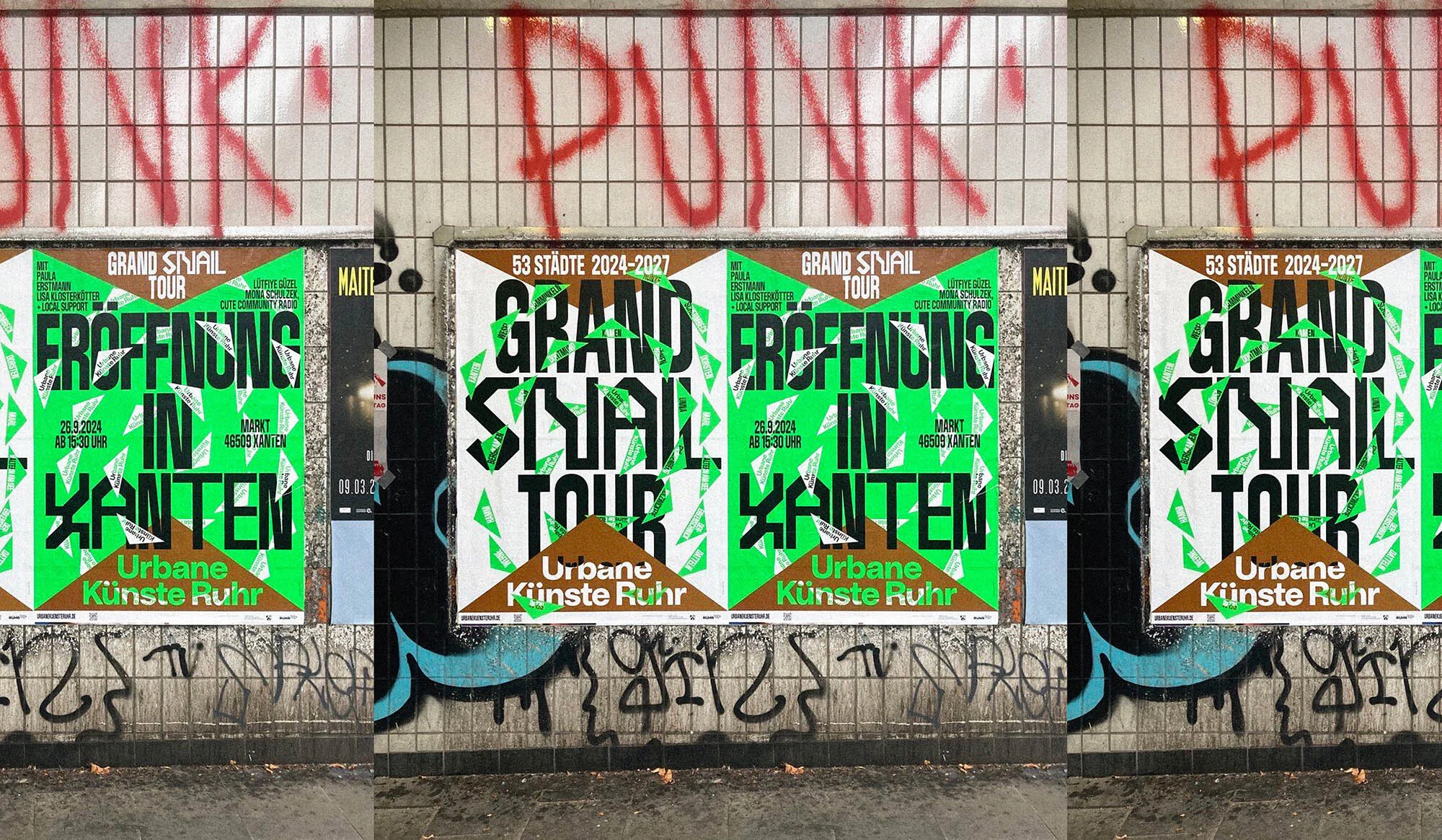
The visual identity of the project, designed by the Berlin creative agency Studio Yukiko, reflects the industrial heritage of the Ruhr while incorporating the vibrancy and contemporaneity of its public art initiatives.

"The entire colour palette is inspired by various elements relevant to the Ruhr region, its post-industrial character, and the overall concept of Urbane Künste Ruhr," explains designer Ira Ivanova. "The colours range from bold and functional tones typical of industrial environments – such as warning colours and control buttons – to organic shades drawn from nature, reflecting the merger between industry and environment in the region." A neon green interacts with these shades to capture attention in urban and public spaces, adding an element of surprise in a post-industrial context.

During the conceptual development, Studio Yukiko discovered that triangles were a recurring motif in post-industrialization – from maps and landscapes to industrial structures and directional arrows – thus providing a unifying visual element for the identity. Alongside a movement system inspired by the spirals of snail shells – reflecting the energy and dynamism of the Grand Snail Tour – the studio created a series of animations to highlight the various aspects of the project. These animations use the triangle in different and dynamic ways through transformations, movements, or integrations with other design elements, a process that Ivanova found particularly rewarding. "It is deeply rooted in the industrial history of the region, yet its versatility has allowed us to adapt it as a guiding system, spatial marker, and even as a playful metaphor," she reflects. "Seeing this single element evolve into such a rich visual language, capable of connecting past and present, has been one of the highlights of the project."
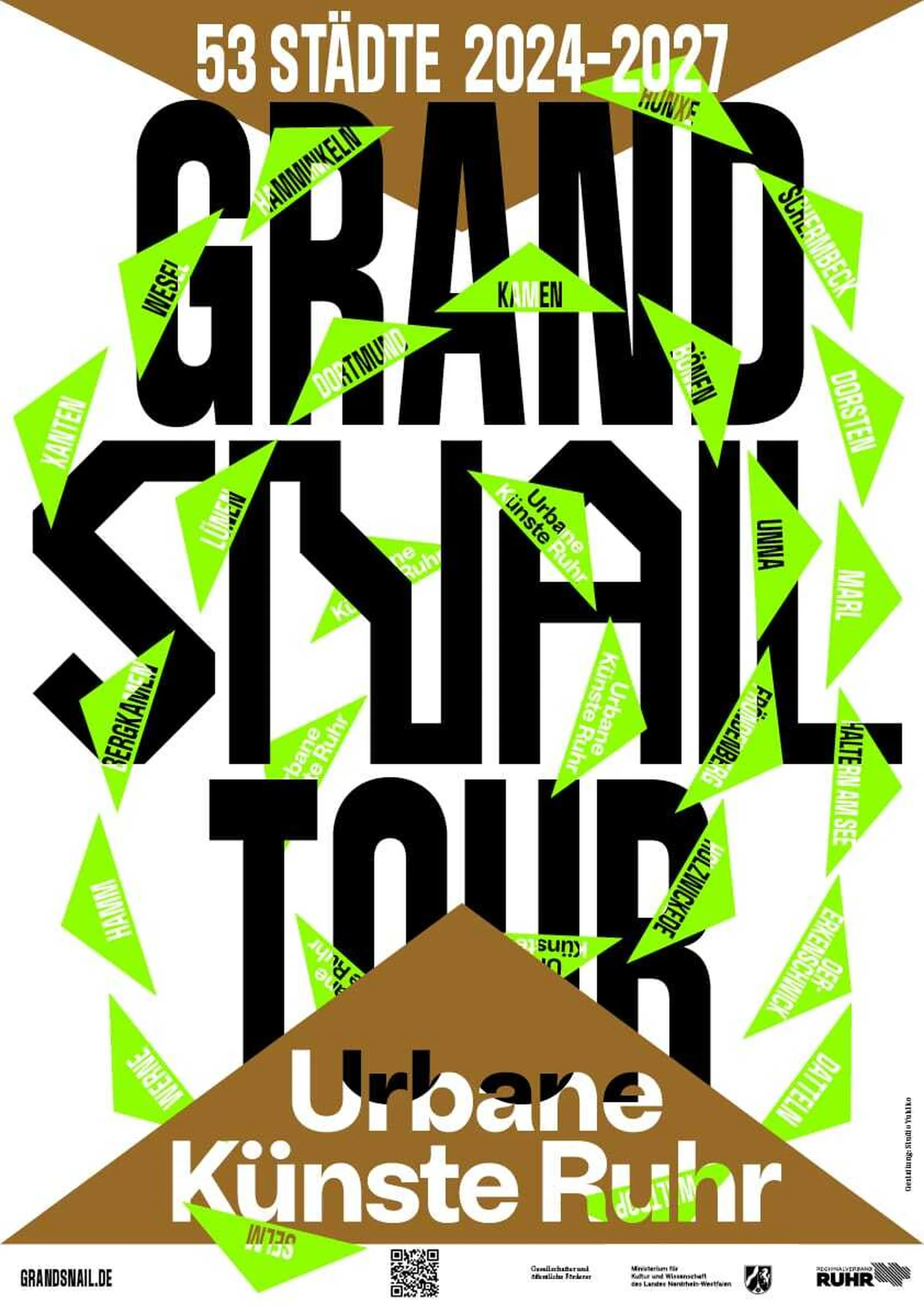
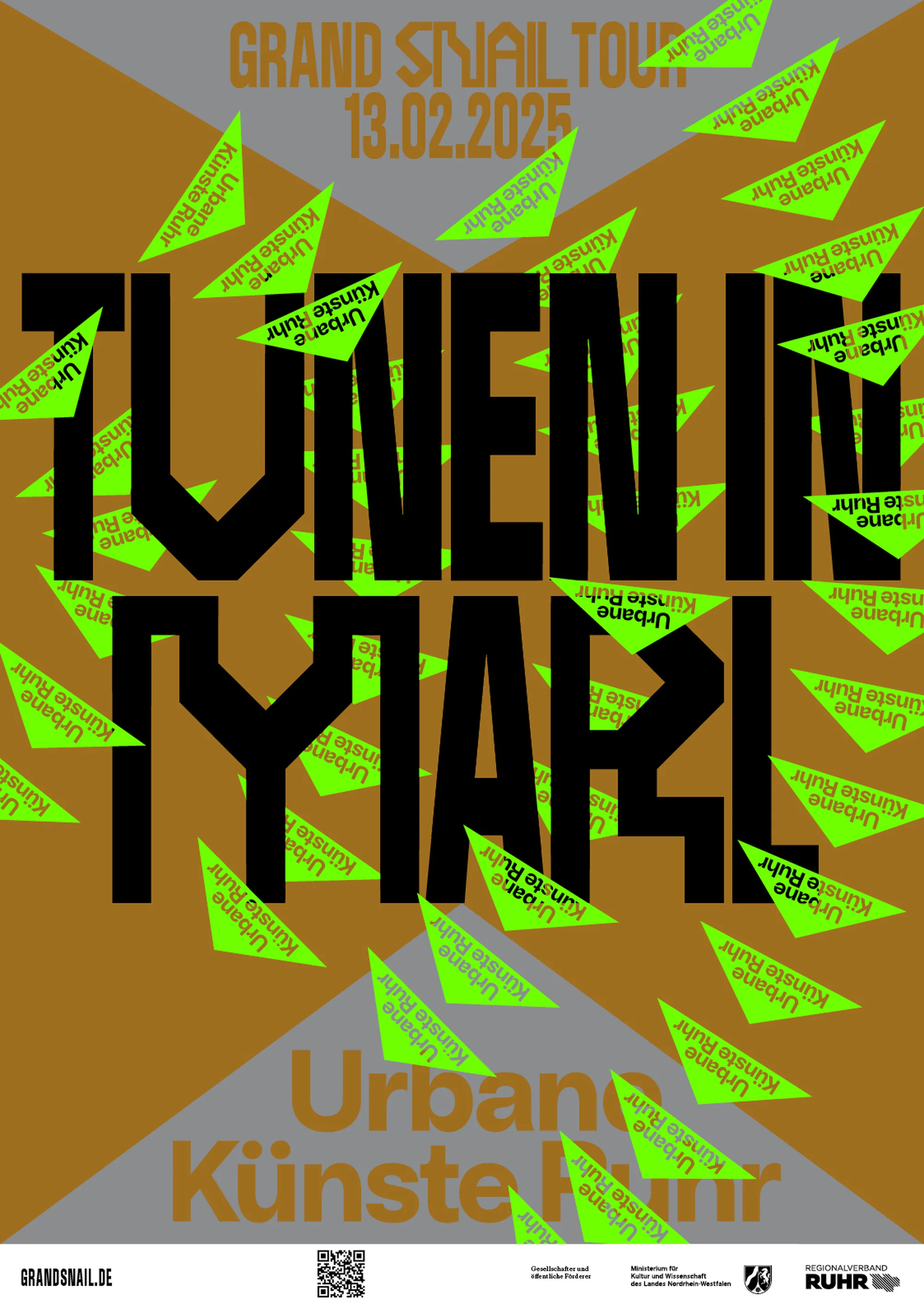
For typography, Studio Yukiko chose Tokyto (modified for the identity by its creator Benoît Bodhuin) to reflect the angular energy of the triangles as the main display typeface. "To make the typography more accessible," Ivanova continues, "we paired Tokyto with Bandit, a condensed and bold sans serif from AllCaps, which matches Tokyto in weight and overall rhythm." For long texts, KH Giga by Kurppa Hosk Type was used, a serif font with exaggerated details, providing effective visual contrast. To ensure continuity with the previous branding of Urbane Künste Ruhr created by Lamm & Kirch, the agency retained the original typeface for the logo, thereby linking the new identity to the established visual language.

Practically, the system needed to be easily usable by the client to create promotional materials and content. For this reason, Studio Yukiko designed a modular and adaptable system, as Ivanova explains: "We worked within a framework that defines general rules for layout, typography, and colour usage, while still leaving room for creativity. Every game needs rules, and this balance ensures that the identity can adapt to different locations, contexts, and scales, maintaining consistency and recognisability in use throughout the Ruhr region."