Brand Identity
The identity of Studio Gruhl for the techno label Spellbound is truly a canvas ready to grow and change.
Date:
19 March 2025
Brand Guidelines, Digital, Identity

When Studio Gruhl was invited to design the identity for the young female-led techno label Spellbound, they realized they had plenty of room to experiment. As creative director Malte Gruhl explains, working with young brands is always fun; there are fewer bureaucratic hurdles to overcome and there's also an appetite for bending the traditional rules of "freshness." And that’s exactly how things went for Studio Gruhl and Spellbound: the final identity is overflowing with character; it grabs your attention and demands its presence.

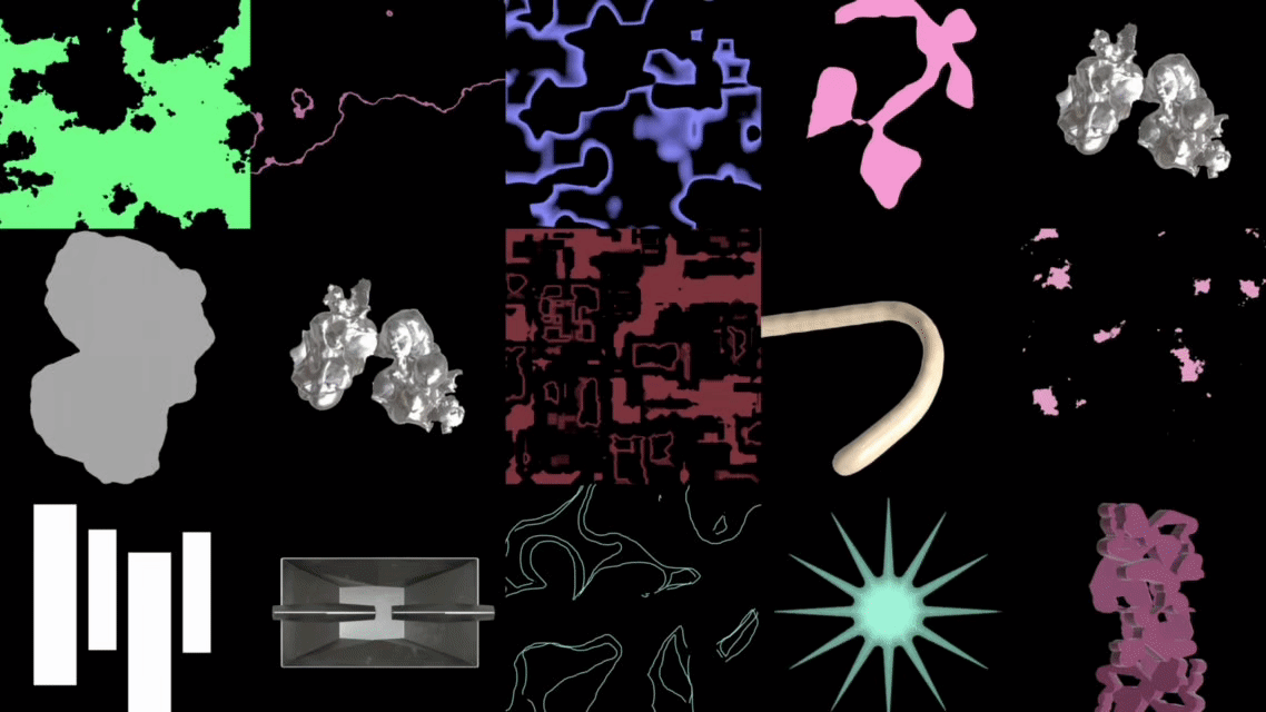
"What we did for Spellbound was create a kind of canvas – a base grid that, along with the colour palette, typography, and logo, can stand alone or be expanded with 2D and 3D illustrations for static and moving materials. A bit like a volume dial: Spellbound can turn up the volume by adding more and more elements on the canvas or be more contained and direct when necessary," Gruhl explains. The studio achieved this by creating a fundamental structure that they then treated as a foundation for a collage, layering 2D shapes, cuts wrapped in gradients, and bold 3D shapes. Much of the inspiration comes from Berlin’s early 90s techno scene.

"It was crucial for us to represent DJ Shaleen's vinyl sets. We did this by going back in time, to when this format was the standard at the dawn of Berlin techno," Gruhl recounts. "From there we drew our visual inspirations – whether it’s raw and brutal 3D elements inspired by digital art and pre-internet VJ sets, or a slightly off-tone colour palette, everything points back to the 90s, when techno resonated in abandoned houses or empty factories."
While the wordmark and design system form the backbone of the canvas, the content represents the artwork that fills it. To create it, the team developed three conceptual pillars of the brand:
Attitude of Berlin
Traces of Berlin
Colours of the City
"Everything had to look very direct and raw, yet be completely adaptable – a bit like a collage. For example, for ‘Traces of Berlin' we scanned ripped posters and found textures from the street, and then rebuilt them in 3D or used them as visual overlays in the graphics," Gruhl explains. "We transferred this analog heritage into the digital world, where we enjoy operating, and at the same time we generated over 50 different assets for the brand launch."

Everything was built to be elastic and expandable. The collage system is flexible and easily lends itself to continuous iterations. The studio ensured that, using this framework, Spellbound can adapt layouts, mix various assets from different designers, create diverse visual expressions, and independently develop the system.
"The asset library is entirely expandable, and this was one of our main goals for the project. The overall brand identity should encourage growth and change. What we've created informs how the brand can appear but also invites other designers or artists to make it their own and evolve it," Gruhl states. "We are very satisfied with how we've set the foundations, but we are equally excited to see where the brand goes from here and how it will grow and adapt over time. In an ideal scenario, Spellbound will have a continuously expanding asset library and individual reinterpretations of the brand's pillars that can be reviewed and developed over time."

To maintain cohesion in this active and expressive design system, the team created a custom wordmark that needed to be strong and "generate a certain visual urgency." Considering the environment of music labels, Studio Gruhl established that the logo needed to work across multiple touchpoints – from co-branding environments to smaller spaces. The strong, curated brand does all of this, becoming an anchor in the broader design system and ensuring continuity as the rest of the canvas evolves.
For the brand typography, Gruhl explains that they chose the open-source fonts Anton and Nimbus Sans L, so that "Spellbound can collaborate more easily with other designers and artists in the future. When we work with emerging brands, we prioritize simplicity and ease of use for the access and utilisation of the assets we provide."