Brand Identity
The Belle Époque-inspired design by Glasfurd & Walker for Bellamie deserves a place in your bar.
Date:
18 March 2025
Identity, Packaging, Label
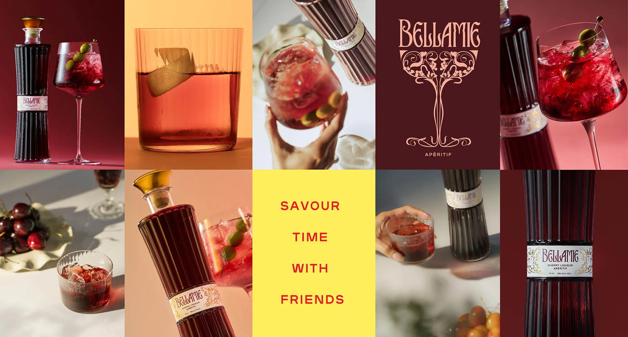
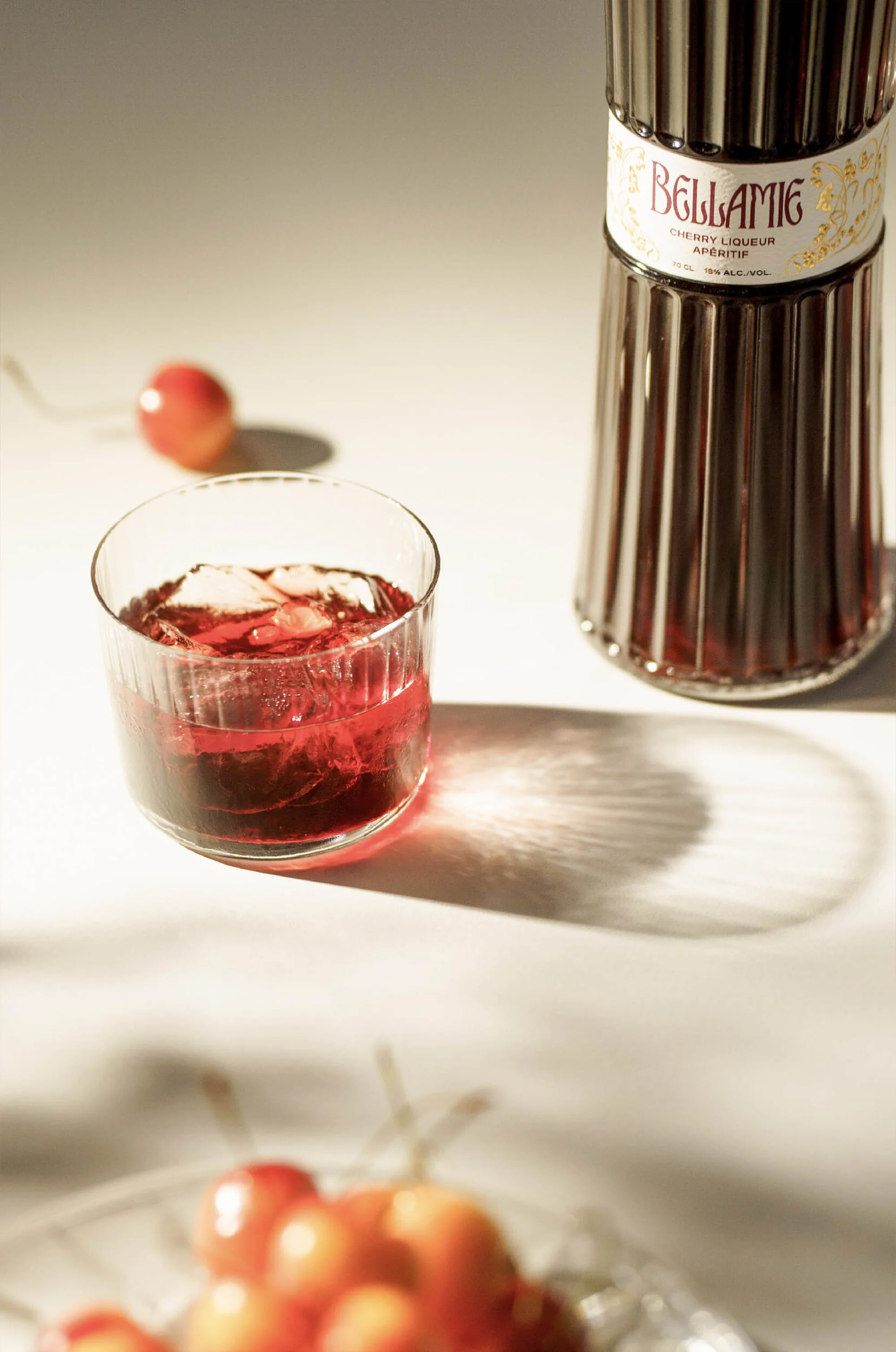
Marking the moment when day meets evening, the aperitif is the perfect break to slow down, spend time with friends and family, and enjoy a light aperitif that stimulates the appetite. In the case of Bellamie, a reinterpretation of the almost forgotten French liqueur "Guignolet" with its rich cherry flavour, founder Marie Voirin wanted the brand, label, and bottle design to celebrate life and French heritage. Collaborating with global branding agency Glasfurd & Walker, the result reflects exactly this, drawing inspiration from the Art Nouveau movement. This style is closely associated with the Belle Époque, a culturally and artistically flourishing period—profoundly French—during which life was celebrated. As Voirin explains, "This artistic movement, during an era of hope, prosperity, and beauty, seemed the most fitting".
"Ornament is at the heart of Art Nouveau," explains Phoebe Glasfurd, co-founder and creative director. "Its essence lies in the intricate weave of typography, illustration, and frame-like compositions that create a sense of fluidity and elegance." To capture this spirit, research into the historical elements of Art Nouveau design was meticulous and thorough. The team drew from numerous archival sources, including the Treasury of Art Nouveau Design & Ornament (Dover Pictorial Archive), which inspired the harmony between typography and decoration. Also taking cues from glass books like La Pique and vintage Annuals from Graphis, the team studied historical glass craftsmanship and luxury packaging design to refine their approach to textures, light, and ornaments.
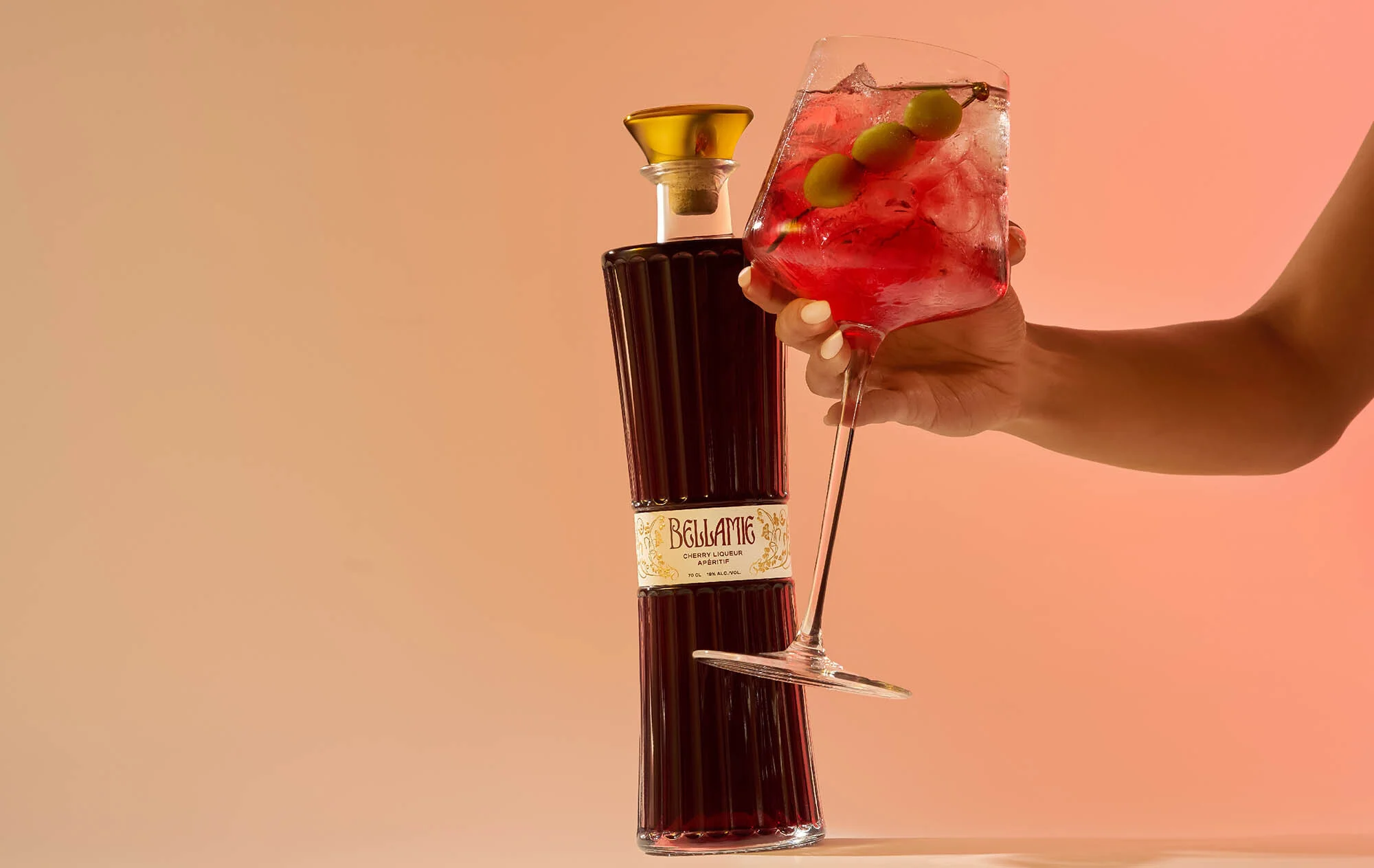
Furthermore, perfume bottles and their packaging became the guiding principle for Bellamie's visual identity. Voirin explains: "I wanted Bellamie to convey a sense of timelessness. The fragrances, both vintage and modern, symbolize that 'everyday luxury' which anyone, regardless of age or background, can aspire to. Bellamie had to be beautiful, sophisticated, yet accessible." Glasfurd adds that the perfume packaging is inherently minimalist due to limitations: "Small labels, a clearly visible brand name, a contained colour palette – every detail is carefully considered."
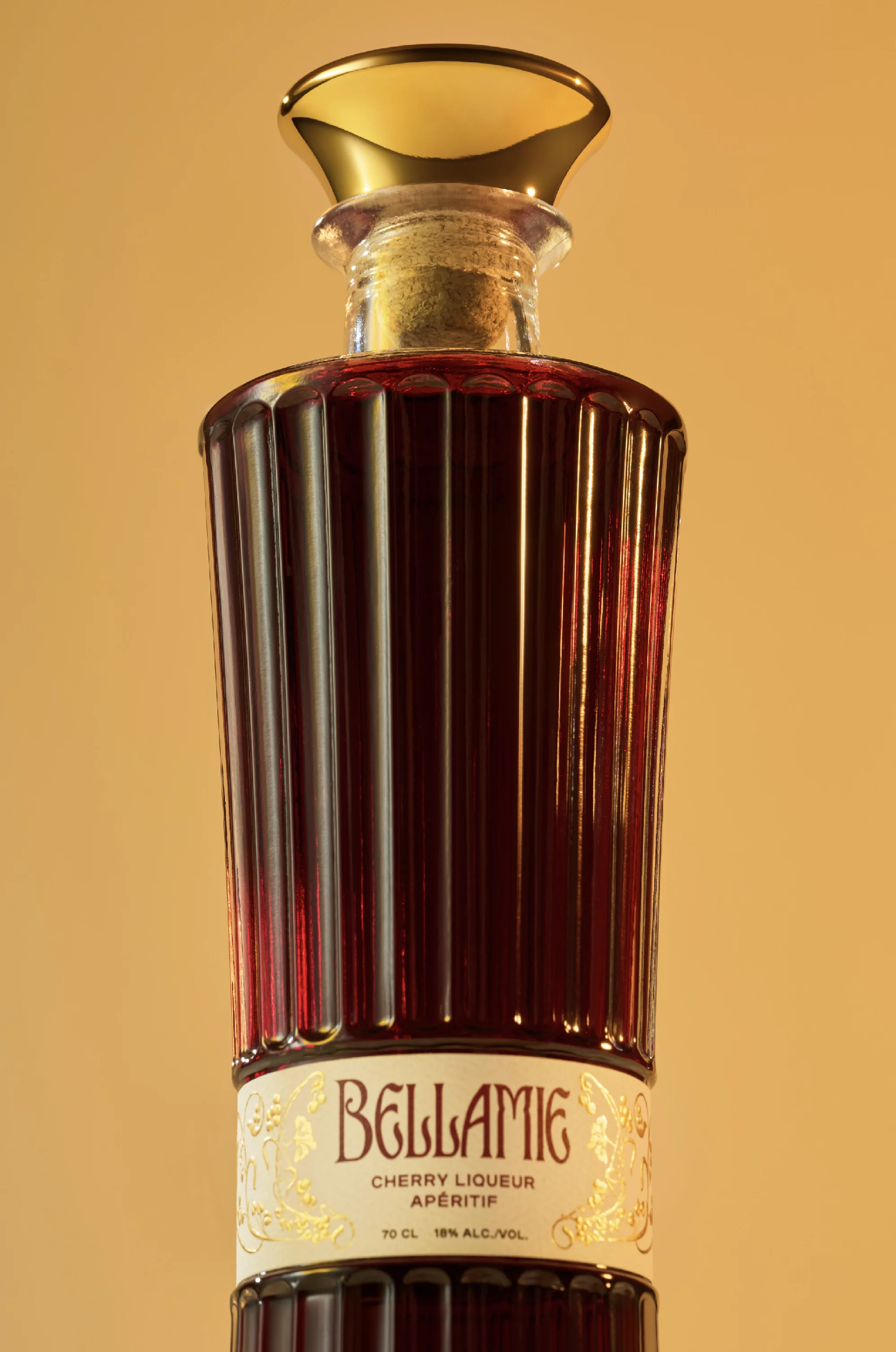
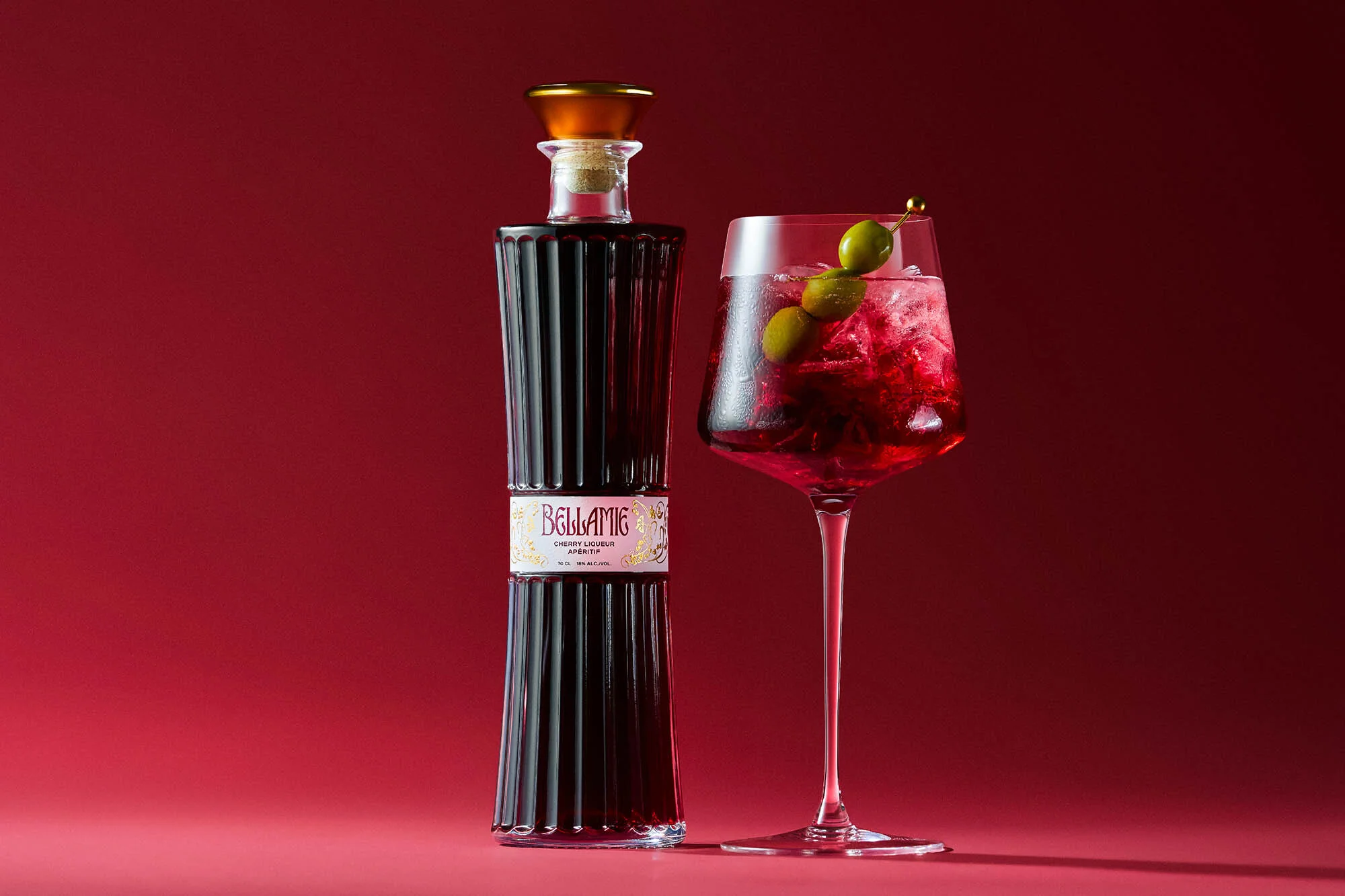
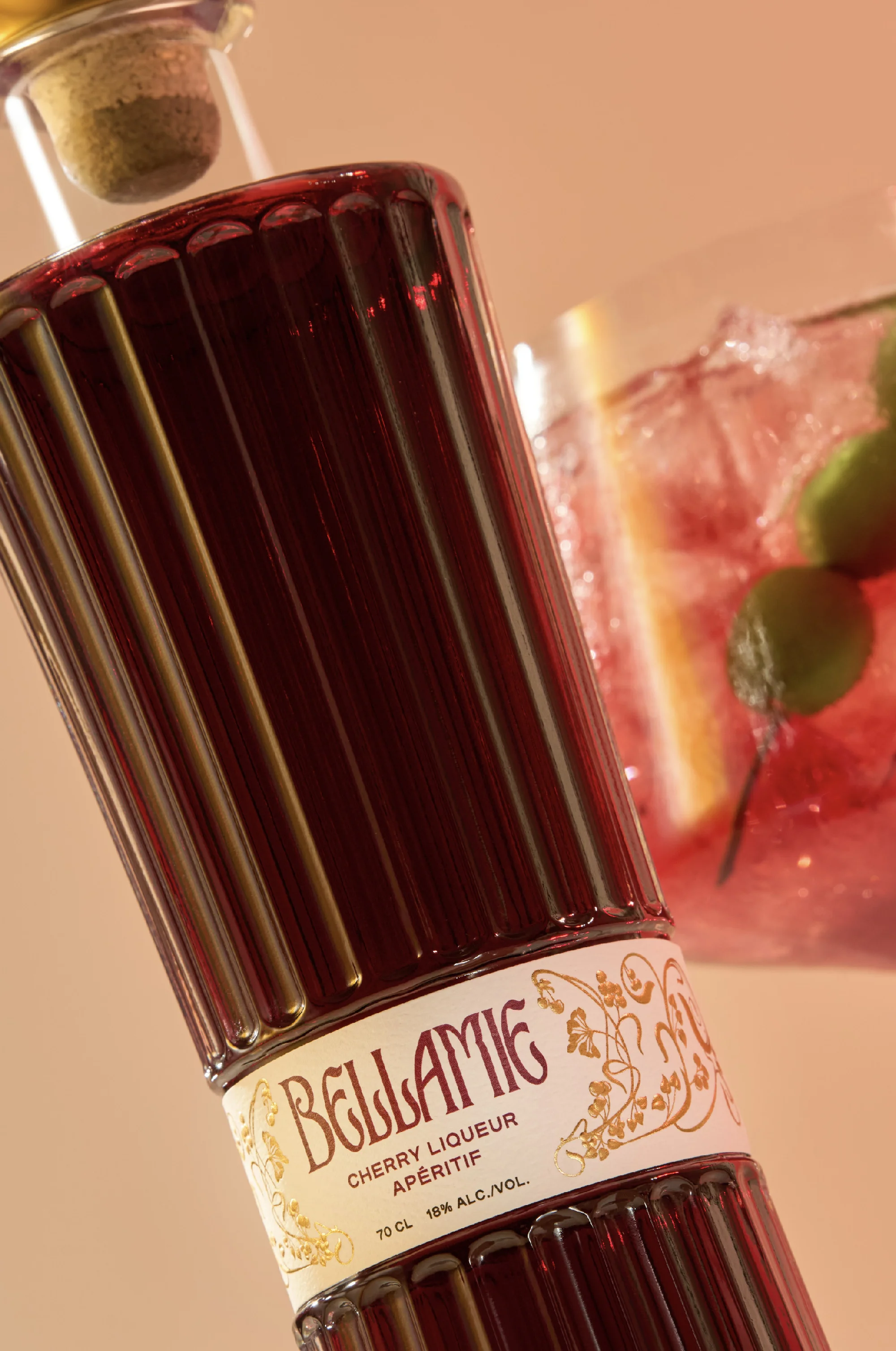
The final design of the bottle features an elegant, fluted silhouette with graceful curves and a brass-finished cap, evoking undeniable sophistication and referencing the realm of fragrances. Beyond the shape, the label helps reinforce this connection with a minimalist aesthetic, enriched by gold foil details, registered embossing, and refined frames. The typography, precise and elegant, calls to mind that of luxury perfumes, resulting in a distinctly Bellamie style. "From a distance, it appears minimal, but up close, the craftsmanship is evident."
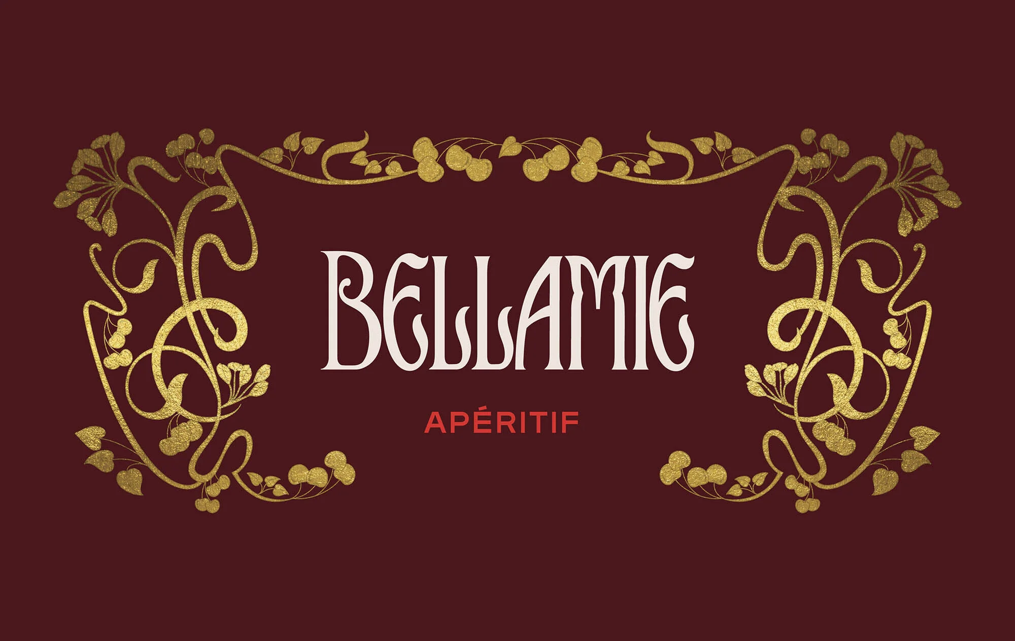
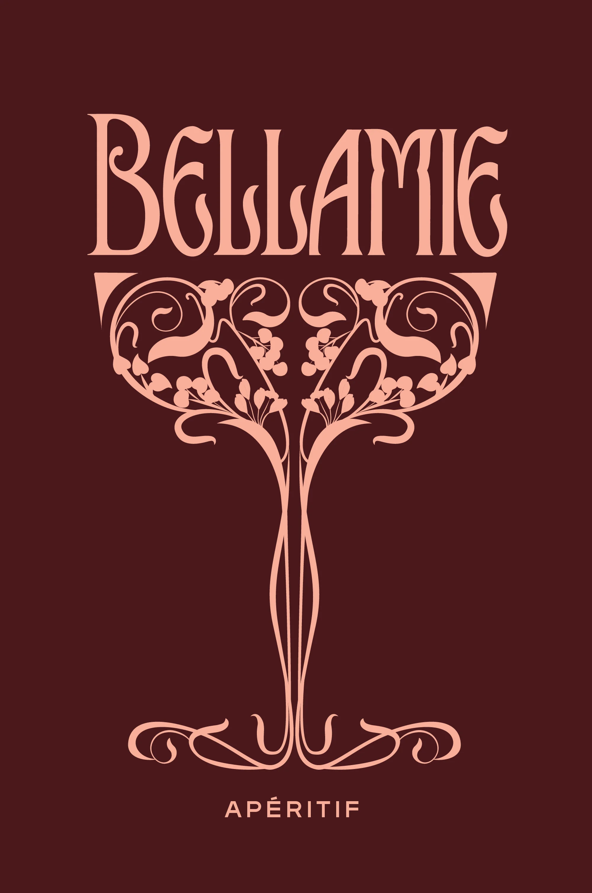
Every letter of the wordmark has been carefully designed, drawing from different fonts. "We spent a lot of time researching Art Nouveau typefaces—both historical and contemporary reinterpretations," explains Glasfurd. "We selected the elements we loved and integrated them into a cohesive design." Notably, the letter "E" is inspired by TAN Astoria, while the "B" takes cues from De Arloy. Surrounding the wordmark is a freehand illustration themed around cherries, influenced by the work of Alphonse Mucha, with flowing shapes echoing the brand's organic beauty.
For the supporting typefaces, the team chose fonts that complemented the Art Nouveau aesthetic without sacrificing readability and functionality. "We selected Plaax, designed by 205TF, inspired by French street signs – a natural link to Art Nouveau and the brand's French heritage." The design of Plaax balances femininity and structure through geometric shapes and elongated proportions, marrying technical requirements with luxury aesthetics. For headings and details, Glasfurd chose Meno Display as a neutral and classic counterpart: "It harmonises perfectly with the Bellamie wordmark and, while being elegant and refined, allows the other elements to stand out."
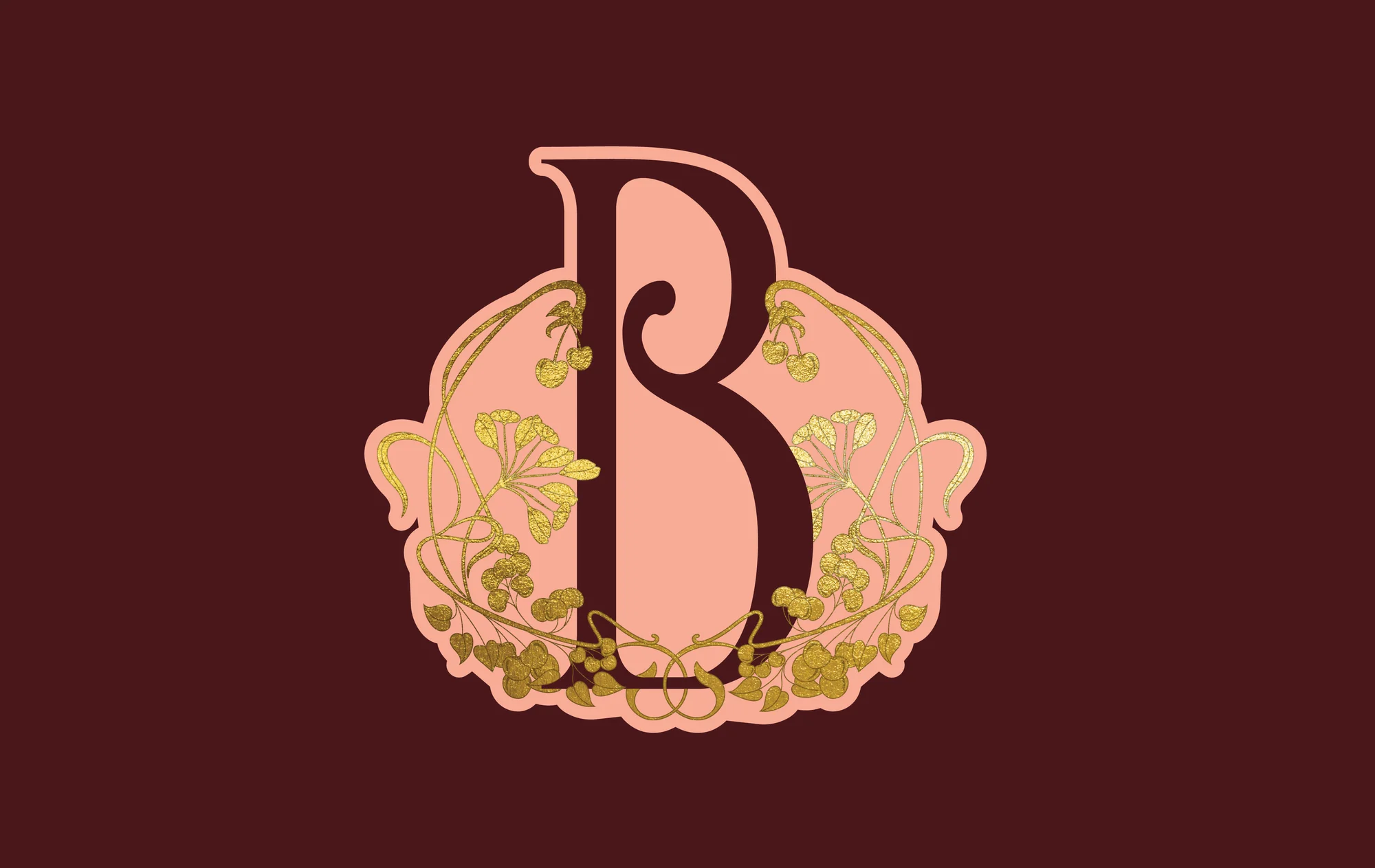
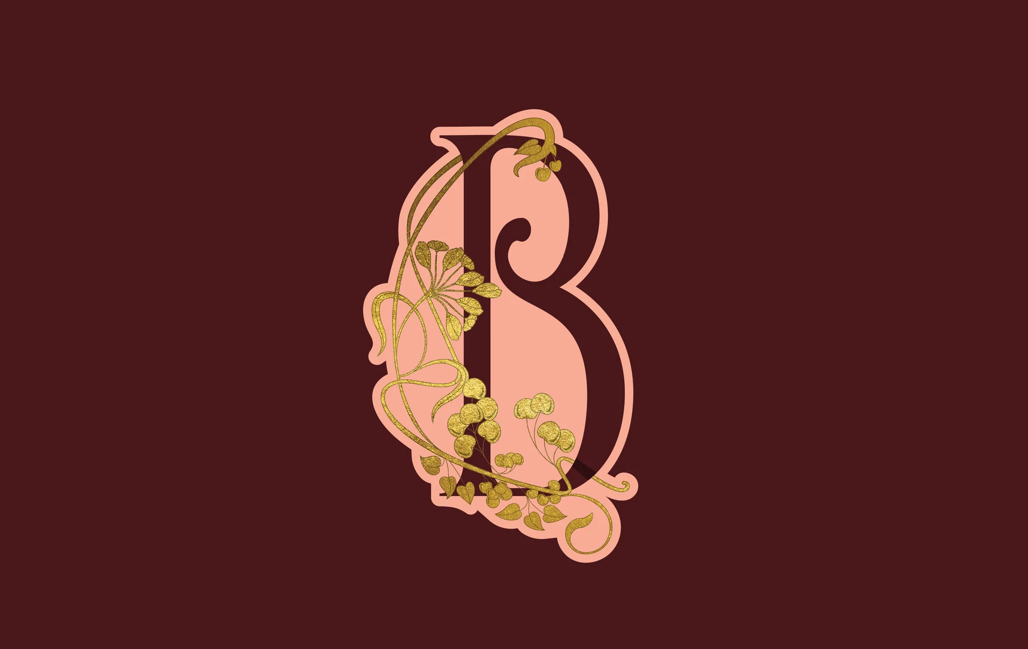
For the monogram, the team took a more artisanal approach, seeking inspiration from antique French brooches found on eBay. The intricate letters from those designs were incorporated into a symbol that connects the history with Bellamie's modern identity. This visual element, depicting a cherry tree, enriches physical touchpoints such as stationery and the caps of sample mini bottles, where space is limited. "It was important to have a smaller element that distilled all the distinctive traits of the brand, capturing the spirit of Bellamie in a concise brand mark," adds Glasfurd.
These elements work in synergy to create a sophisticated yet accessible identity, honouring historical inspirations and contemporary appeal. "The packaging is an essential part of building Bellamie's world—setting the tone for the entire brand experience. Every element, from the bottle to the label, has been chosen to immerse the consumer in a sense of timeless French luxury and celebrate the joy of the moment," concludes Glasfurd. "The packaging defines Bellamie's world—everything else about the brand builds around it."