Brand Identity
Carla Palette's brand for Romeo’s makes your mouth water.
Date:
26 March 2025
Branding, Design, Identity
Romeo's is the first sandwich shop dedicated to Berlin and, as a pioneer, it aimed to stand out from classic fast food chains. The objective for the visual identity was to find a balance between the past and the present: an aesthetic inspired by old-time advertising, but reinterpreted in a contemporary way. To tackle this creative challenge, the brand turned to designer Carla Palette.
"The visual direction of Romeo’s draws inspiration from vintage advertising aesthetics, particularly from the marketing of fast food in the past and the culture associated with it. The identity draws on nostalgic visual styles, modernizing them to propose a fresh and sophisticated reinterpretation of fast food. The combination of bold typography, classic serif fonts, and a nostalgic yet refined colour palette reinforces this connection," explains Palette.

The research phase focused on analysing the classic typography of fast food, the psychology of colours, and witty advertising slogans, drawing inspiration from brands like McDonald's and Burger King, as well as references to pop culture – with a particular nod to the story of Romeo and Juliet – to define a playful yet determined tone of voice.

Following the influences of vintage branding and advertising trends from the 1970s to the 1990s, a bold and straightforward typographic approach was adopted, eliminating every superfluous element.
“The typography-focused approach was chosen to align with classic advertising aesthetics, providing a strong visual impact and making the brand simple, direct, and immediately recognizable,” highlights Palette. “By focusing on letters rather than complex graphics, Romeo’s embraces the timeless charm of vintage fast food brands, where typography played a fundamental role in identity and communication.”

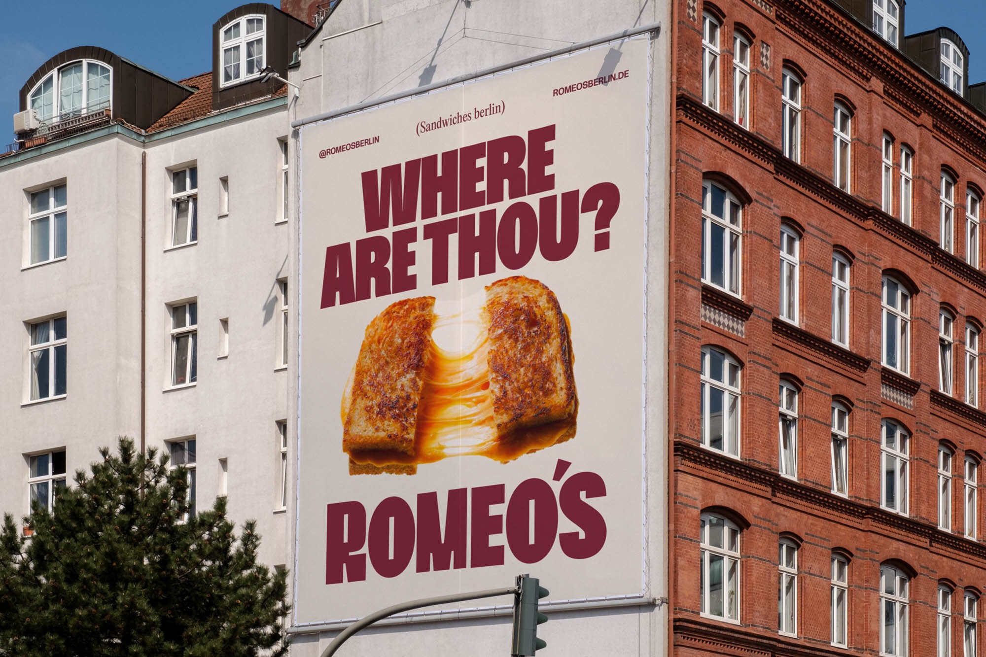
A bespoke wordmark was created, based on the Bueno typeface, customizing the letters ‘R’ and ‘M’ to add character and personality. The choice of Bueno was guided by its retro shapes, perfectly in tune with the overall concept.
“The custom modifications are inspired by the signs of fast food and diner establishments from the mid-century, with targeted adjustments to enhance expressiveness and recognizability,” explains Palette. “The refinements include slight tweaks to the letter forms, adjustments to spacing, and unique details that reflect the artisanal attention and quality of Romeo’s sandwiches. These changes, although subtle, give the wordmark a balance between nostalgia and modernity.” To complete the typographic palette, Bueno was paired with a serif font for secondary text, adding depth to the identity.


Regarding the art direction, the sandwiches were made the visual protagonists, with text wrapping around and highlighting them.
“This approach reflects the brand's philosophy: no frills, just quality. Just as a great sandwich doesn’t need excessive decoration, the visual identity aims at the essentials,” explains Palette. “The close-ups, well-lit and styled naturally, highlight the craftsmanship and deliciousness of each sandwich while maintaining an accessible and unpretentious style. By eliminating distractions and focusing on sincere and direct images, the brand reinforces its identity as a reference point for sophisticated comfort food: simple, iconic, and incredibly tasty.”