Identity
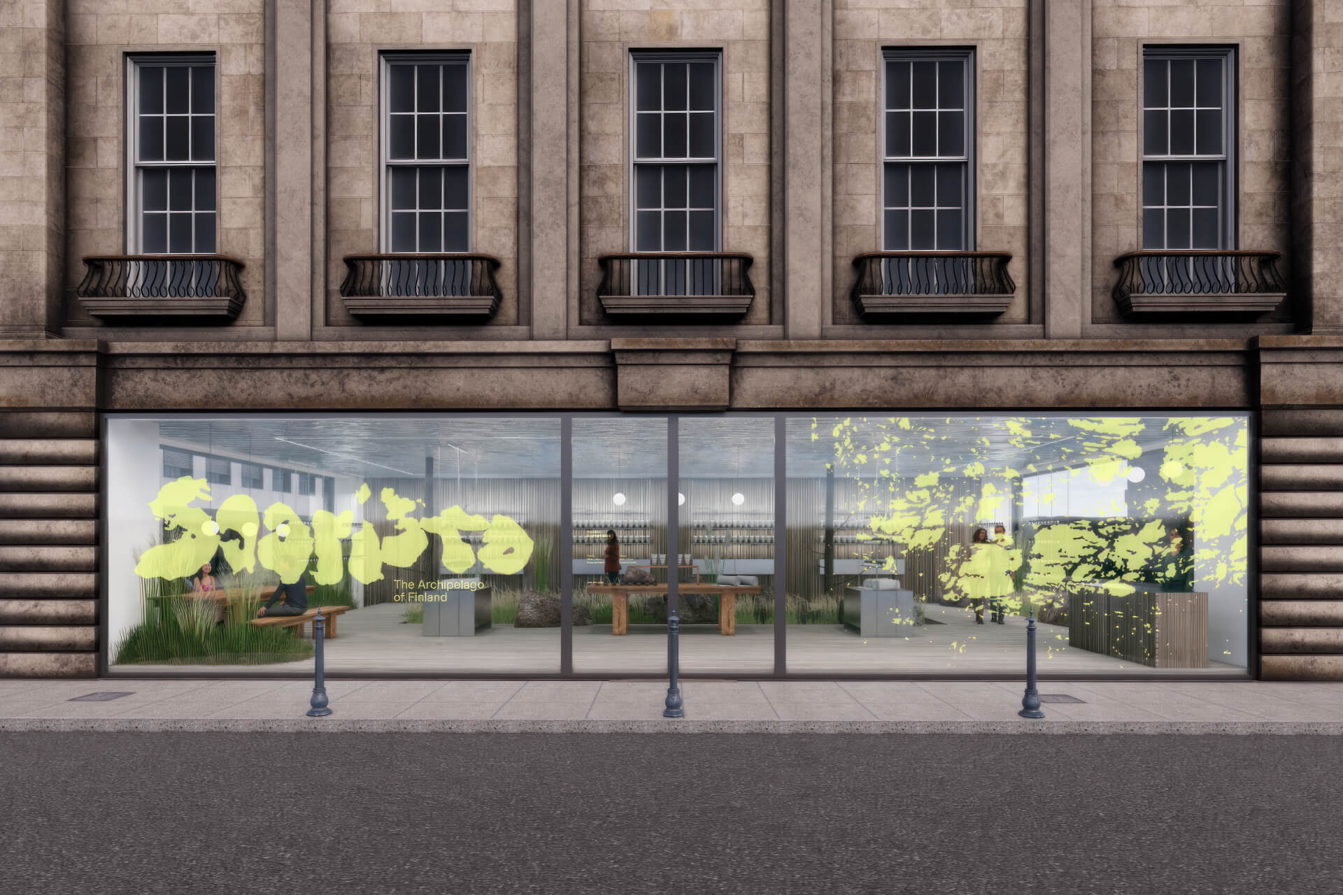
BOND transforms the "Archipelago of Finland" into a living typographic character for the identity of Saaristo.
Date:
25 March 2025
Advertising, Identity, Website


Composed of 40,000 islands and islets, the Finnish Archipelago, known as Saaristo, is a unique place in the world, so much so that it is considered "the most diverse archipelago on the planet." It is a place that must be seen to be truly believed. To attract more visitors, Saaristo turned to the BOND studio in Helsinki, with the aim of creating an engaging and memorable visual identity.
"Our goal was to visually capture the feeling of being there – to create an identity that was true to the place, not something imposed from the outside," explains Senior Designer Kasperi Salovaara. "It was about distilling the essence of Saaristo into an authentic and evocative visual language."
The BOND team had the freedom to adopt a more conceptual approach compared to traditional tourist branding projects. Guided by three key themes – simple and rich, caring and gentle, wild and sincere – they let Saaristo tell its own story.


"The entire brand is shaped by Saaristo," reveals Salovaara. And so it was. To create the logo, the team spent countless hours exploring Google Maps, convinced that among the 40,000 islands it was possible to find each letter of the alphabet hidden in their shapes. Island after island, they selected, captured screenshots, and noted potential outlines that could transform into letters. To ensure consistency in typographic details, each chosen island shape was printed, hand-traced, scanned, and then meticulously redrawn in Illustrator.

The final result? A sculptural design based on the actual contours of eight islands of the archipelago – an authentic and tangible tribute to the territory. "During the process, we encountered an interesting episode: one of the islands 'disappeared,'" recounts Salovaara. "We spent two days looking for it on the maps, until we found it again – an experience that testimony to the vastness of the archipelago."


If creating the lettering and the logo required satellites and infinite patience, the art direction – carried out in collaboration with the Finnish production house Duotone (Juho Huttunen for still images and Sam Gladstone for videos) – took on an immersive and intensive approach. The team spent two days on an island to explore and define the visual style with which to portray Saaristo.


"By the end of October, daylight was scarce – only six hours – and the weather changed every five minutes, creating an environment as challenging as it was inspiring," recounts Salovaara. "We captured all that visually struck us and allowed ourselves moments of silence, simply to absorb the magic of the place."
A key insight that emerged during the shoots was the constant presence of the unique shapes of the islands, an element that reinforced the centrality of these silhouettes in the visual identity. "Ultimately," concludes Salovaara, "it was Saaristo that shaped the art direction – we just had to observe, listen, and let ourselves be guided."

Among the countless researches conducted by BOND, the team found inspiration in "nautical charts, archipelago signage, and historical texts – like the engravings found on stones." This visual heritage is reflected in the typographic pair chosen for the identity: Muoto of 205TF and Kolonia of ECAL Typefaces.
"Muoto added precision and legibility, balancing the raw quality of the logo when written alongside it," explains Salovaara. "Kolonia, on the other hand, contributed to defining the brand's tone in various contexts, ensuring a cohesive typographic system."


The old maps of the region also influenced the graphic composition. "When plotting the main shipping routes, the text naturally followed the marked path." This detail inspired the idea of incorporating that fluid and dynamic alignment into the textual organization of the identity.
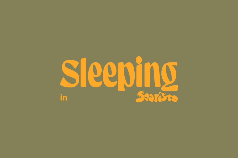
To highlight the unmissable experiences of Saaristo – from sailing and swimming in the sea to the sauna – BOND created a series of sub-brands, each characterized by a logo designed from scratch, capable of capturing both the activity and the emotions it evokes.
"This approach enriched the overall visual identity, adding a sense of playfulness and spontaneity," observes Salovaara.
"After all, Saaristo is not just serene and picturesque – it can also be fun and out of the ordinary."