Brand Identity
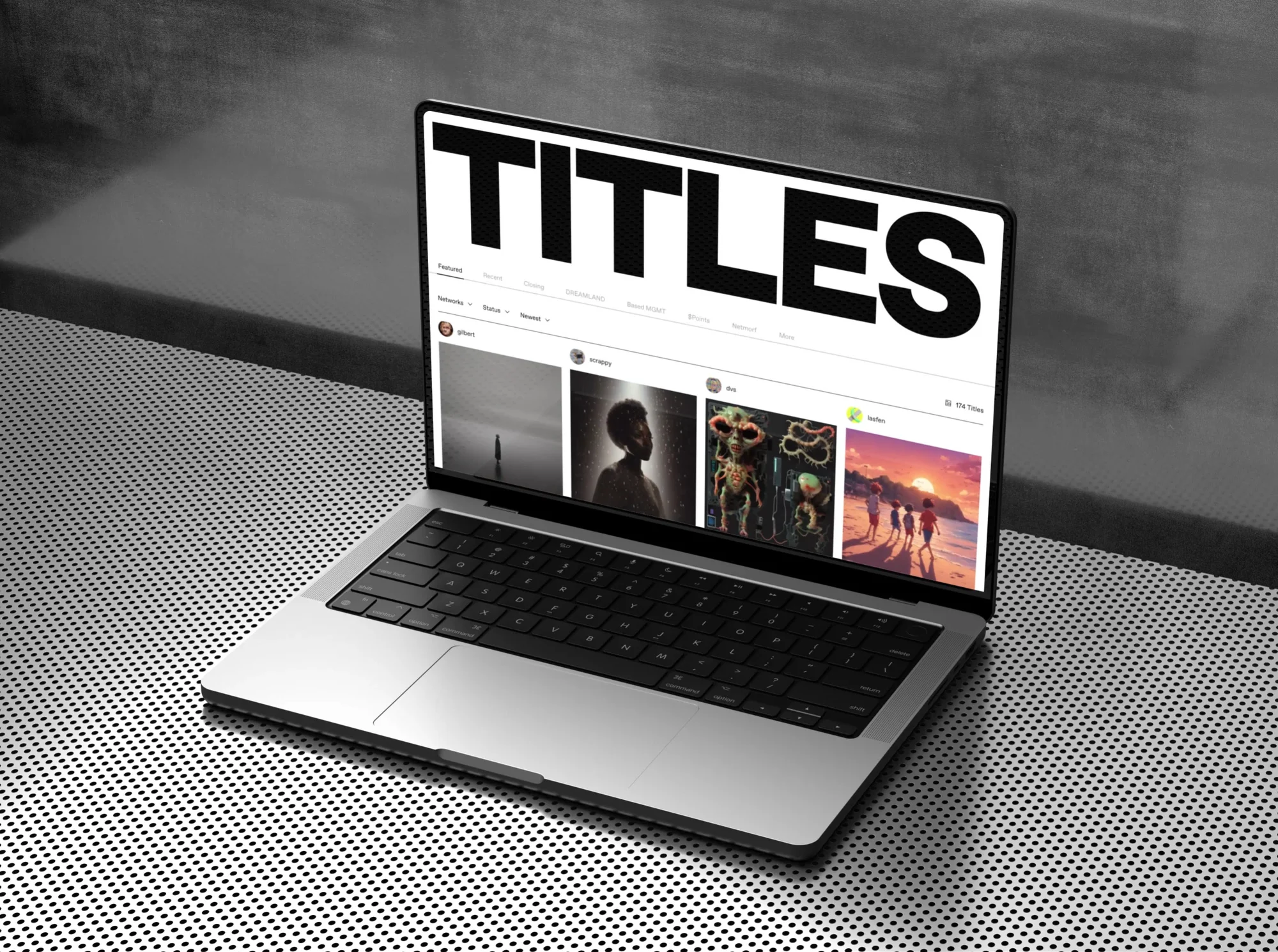
The Collected Works builds a cyclical identity for TITLES.
Date:
28 March 2025
Branding, Design, Identity

“Unlike artificial intelligence systems that extract styles without attribution,” says José Fresneda, Partner at The Collected Works, “TITLES allows artists to define, monetize, and retain ownership of their image.”
This platform offers a system of tools for creating generative works, along with a marketplace to showcase and sell them. At the core of the creative process are always the artists, who train their own custom models. Buyers can then mint the generated works – reflecting the unique style of each artist – using Ethereum, thus ensuring attribution via blockchain and establishing the foundation for new interpretations, without compromising authorship. According to Fresneda, “it’s all designed to support a vibrant and interconnected creative ecosystem, where each new work contributes to a broader artistic dialogue.”

The Collected Works, a design studio based in New York City and New Orleans, was commissioned to create the visual identity of TITLES, adopting a broad and fluid approach, in line with the platform's nature.
“From the very beginning,” explains Fresneda, “we saw a unique opportunity: not just to highlight the images generated on TITLES, but also to incorporate the idea of a dialogue between artists and the public, a fluid cycle of creation and reinterpretation.”

From this idea arose the most literal creation of a ring, a visual metaphor that became the focal point of the brand's identity.
A continuous and rotating form, which according to Fresneda embodies the philosophy of TITLES:
“These tools do not replace artists, they amplify them.”
Like the cycles of nature, creativity is never static. Instead of presenting a rigid and algorithmic gallery, TITLES remains always in motion, reflecting the organic and evolving nature of artistic influence.
For TITLES, The Collected Works developed a custom generative tool in Blender, allowing users to create infinite expressions of movement by adjusting parameters. These expressions can then be integrated into marketing materials, motion graphics, and UI elements.
“We love developing generative tools,” says Fresneda, “so it felt natural to create one for a platform that is based on generativity.”
Like a gyroscope or the rings of Saturn, each artist model serves as a point of origin, attracting new expressions into its orbit.
“Even when the ‘rings’ transform – showcasing images, interspersed with text, used as rhythmic patterns – they are always traceable to TITLES, reinforcing its ever-evolving nature.”

The symbol of the ring is also present in a variation of the wordmark, transforming into an animated “ringmark” – a looping cylindrical form.
“TITLES had already developed an initial prototype of this concept,” explains Fresneda, “but they liked it so much they wanted to fully integrate it into the brand system.”
For the wordmark, ABC Favorit from Dinamo was chosen for its balance between structure and warmth. “TITLES is a platform where technology supports creativity, and the typeface had to reflect this duality: precise yet not rigid, modern without being sterile.” Completing the typographic system, That That Type’s Lastik, a serif with rounded details, adds greater softness and creates a contrast with Favorit. “This combination allows the brand to move seamlessly between functionality and expressiveness, making it versatile across all media, from the platform's user interface to more editorial marketing materials,” concludes Fresneda.