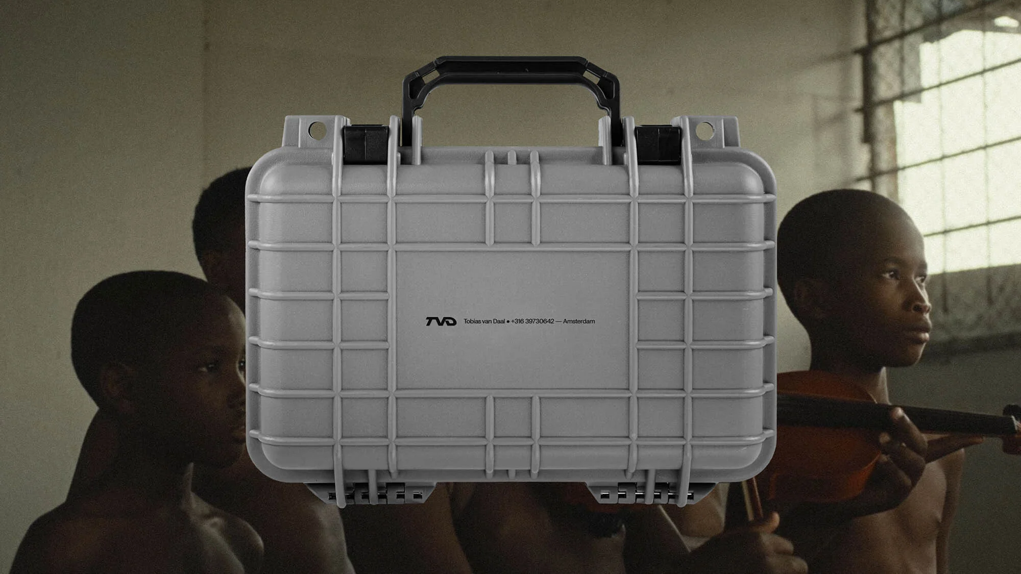
Brand Identity
Anchored by a powerful wordmark, the Twice Shy brand blends past and present cinema.
Date:
27 March 2025
Branding, Design, Identity

Where does one begin to design the visual identity of a cinematographer? It is a professional whose portfolio is a collection of evocative images, with each frame telling a unique story. With a style aimed at a youthful urban audience, the cinematographer and MoVI operator based in Amsterdam, Tobias van Daal, chose to collaborate with the multidisciplinary creative studio Twice Shy – founded by Taryn Blackwood and Jeroen van den Bogaert – to create a portfolio website that can elevate his presence in the entertainment industry.
The goal was to create a platform that helped him stand out in a highly competitive market, while maintaining consistency with his visual language. The design needed to complement and enhance his work, characterised by vibrant and raw settings, resonating with his audience, without losing sight of Van Daal's personality.
During the initial development phases, Van Daal expressed a preference for simple, solid wordmarks. Starting from this idea, Twice Shy proposed a customised solution that blends the features of an icon with those of a wordmark.

“This approach allowed us to transform Tobias's initials into a more iconic composition, rather than just a simple combination of three letters, reinforcing its visual impact,” explains Jeroen van den Bogaert, Co-founder and Design Director of the studio. “Treating the letters as an icon meant considering them as a unique shape – a continuous line – and playing with proportions: curves, the relationship between the inside and outside of the letters, connection points, thickness and width of each element.” The result is a balance between asymmetrical shapes and a more structured and iconic design.
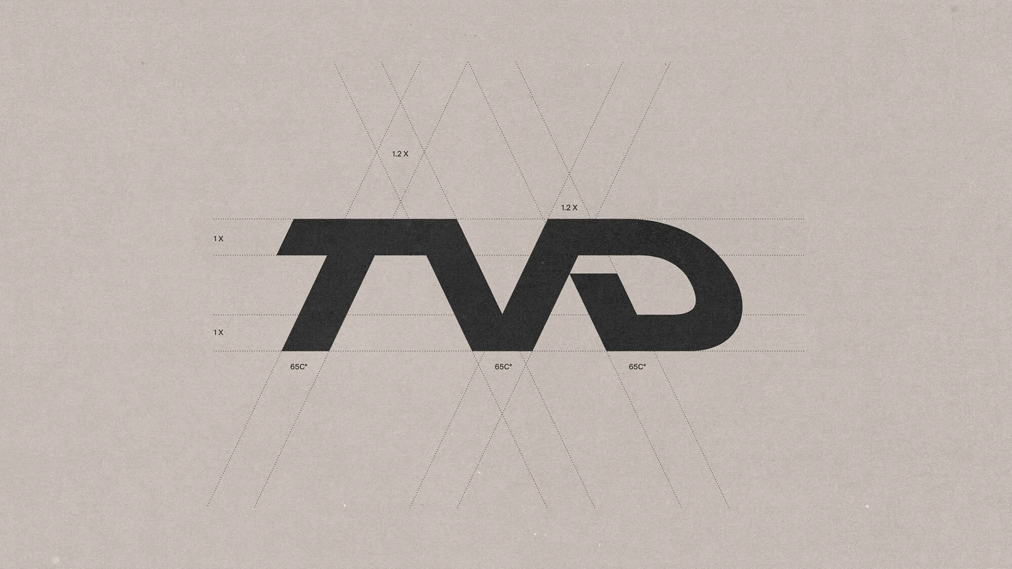
Van den Bogaert describes the result as heavy, solid, and self-assured. “It conveys a sense of resolute pride, a typical attitude of urban environments. The brutalist influence of the logo amplifies this connection with the city's aesthetic: sharp angles, simple shapes, and a solid, unembellished appearance.”
Moreover, the design evokes a sense of nostalgia. During the development phase, some feedback suggested a resemblance to the classic DVD logo, in a positive way. This led the team to explore possible references and parallels without falling into a direct replica.

The 3D renderings of the logo add a contemporary touch to the visual identity, with a metallic texture reminiscent of a window's reflection on a television screen.
“Since Tobias's audience is young, incorporating 3D elements offered various advantages,” explains Van den Bogaert. “It highlighted the dynamic and fluid nature of his work, while simultaneously distancing itself from the association with the DVD logo.”
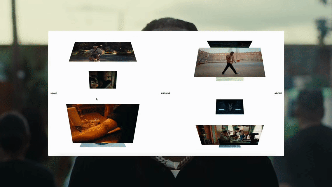
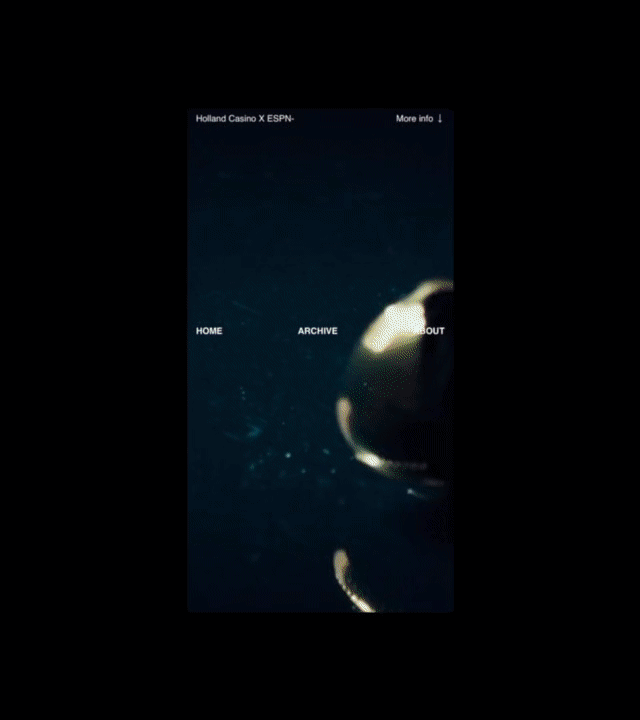
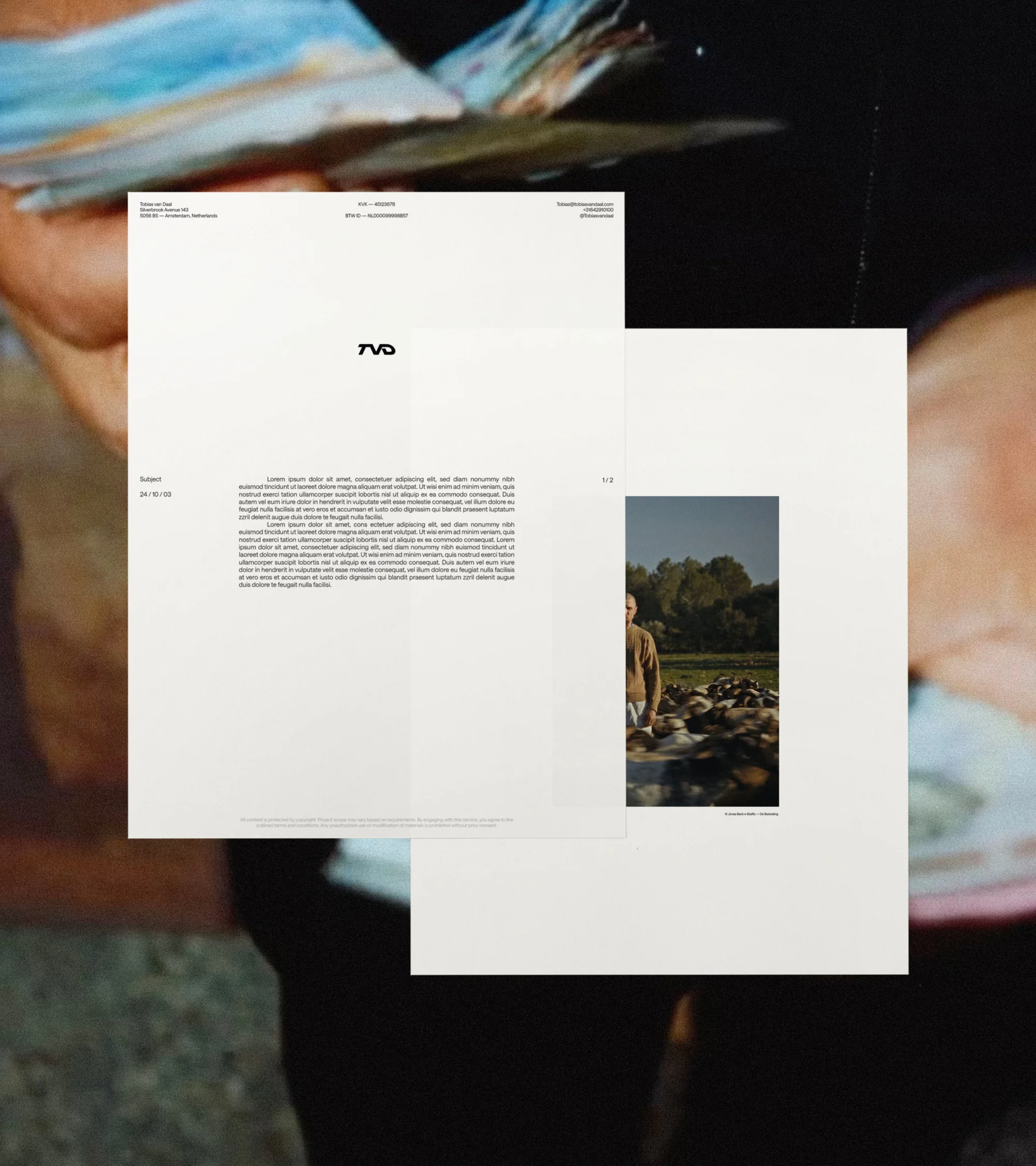
The rest of the identity has been intentionally kept essential and well-structured, with symmetric elements and precise organisation. This has created a professional appearance that, although seemingly contrasting with Tobias's youthful style, perfectly aligns with the quality of his projects. The graphic setting ensured that his work remained the true protagonist: large background images set the visual tone, while on some pages they are blurred to break up the white space, maintaining the character of his material.
Reflecting on one of the early conversations with Van Daal, Van den Bogaert recounts:
“I had a vague idea of designing a minimalist website inspired by the Electrotachyscope, a historical device for moving images developed by the chronophotographer Ottomar Anschütz between 1886 and 1894. The Electrotachyscope displayed images on a circular wheel and, by spinning it, the images came to life.”
To pay homage to this historical reference, subtle rotations were incorporated into the site’s interface.
“As with the logo, the intent was to create a connection to cinema that was more perceptual than literal, capable of resonating subconsciously with the observer.”