Brand Identity
The restyling of ONBOX for the Stocktwits trading social hub focuses on speed, community, and memes.
Date:
14 March 2025
Advertising, Identity, Digital

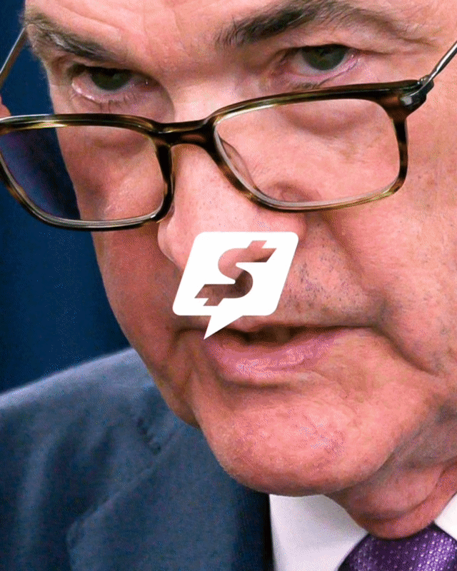
Stocktwits, the birthplace of the "$cashtag" and a hub for market ideas, strategies, and discussions, has become a beacon for over 10 million users. It is the largest social platform for investors and traders, witnessing the dramatic evolution of the financial landscape, where markets are faster and more accessible than ever, and a new generation of investors is constantly online. Stocktwits has evolved to align with what its CEO Howard Lindzon calls "The Degenerate Economy" - a space where finance, speculation, and entertainment intersect. This evolution, as noted by Adam Hartley, Principal of ONBOX, has made investing more inclusive, meme-driven, community-focused, and faster than ever.

Stocktwits collaborated with the branding and design studio ONBOX to create a new image in line with the "Degenerate Economy" and beyond, adopting a visual language that reflects their bold and unrestricted approach to the world of finance. By focusing on the fundamental pillar of community, ONBOX has positioned Stocktwits as the reference platform for modern conversations about the markets, where the "$cashtag", now included in a speech bubble, represents "the ultimate space for connection, conversation, and community around finance."


"We drew inspiration from platforms like Discord, Reddit, and Twitter, where conversations happen in real-time," explains Hartley from ONBOX. "But we were also inspired by entertainment and gambling culture, particularly sports betting. There is a sport-like aspect in how this audience interacts with finance – always alert, responsive, and analytical."


The main request was clear: "Make it fast, then even faster." Speed was literally essential. While maintaining the brand's characteristic blue, the studio introduced visual elements and textures that capture movement and volatility, such as gradients and dynamic color treatments. Among these stands the new primary blue-cyan gradient, dubbed "Pulse", reflecting the market's ongoing mood changes while remaining anchored to its role as a social and financial platform.
"Every choice was made with the understanding that the user-generated conversations – memes, financial insights, and quick exchanges – are at the center of the stage," continues Hartley. "Instead of competing with the content, the design system was built to elevate and frame them." This core identity was designed to thrive in different digital spaces, allowing user humor and discussions to shine.

Bold and self-assured, the custom wordmark uses Paralucent Condensed Heavy Italic from Device Fonts as its starting point. "It’s bold, heavy, and has the right amount of eccentricity," says Hartley. To make it unique and memorable, the team used italics to convey speed and dynamism, adding notches on the letter "t" to create contrast and character. Additionally, a subtle speech bubble has been incorporated into the "ts" ligature – a clear nod to the conversational nature of the platform. "It’s a brand that speaks to both the history and the future of Stocktwits," Hartley adds.
To complete the typographic system, ONBOX uses an unmodified version of Paralucent Heavy Condensed Italic for brand statements and short, sharp lines, "reflecting the strength of the wordmark and adding a playful touch where necessary." For longer texts and daily communication, DM Sans from Colophon Foundry was chosen, a low contrast geometric sans serif that ensures accessibility, cleanliness, and wide language compatibility.